GanderCom Web Solutions
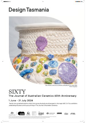
Design Tasmania A-Frame (sandwich board) inserts
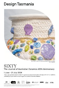
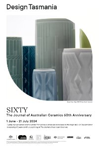
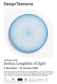
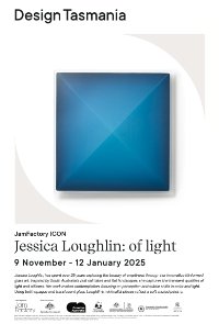
For each exhibition I produced designs to be printed onto corflute for a-frame sign inserts. The design was prescribed - based on the DT brand guidelines, but I chose the imagery and worked the text and funder logos into the space.
Below is a selection of the designs I produced. The first were two for a touring exhibition of ceramics - SIXTY: The Journal of Australian Ceramics 60th Anniversary. The second feature glassworks by Jessica Loughlin, the a-frame inserts were for the JAM Factory touring exhibition Jessica Loughlin: of light.